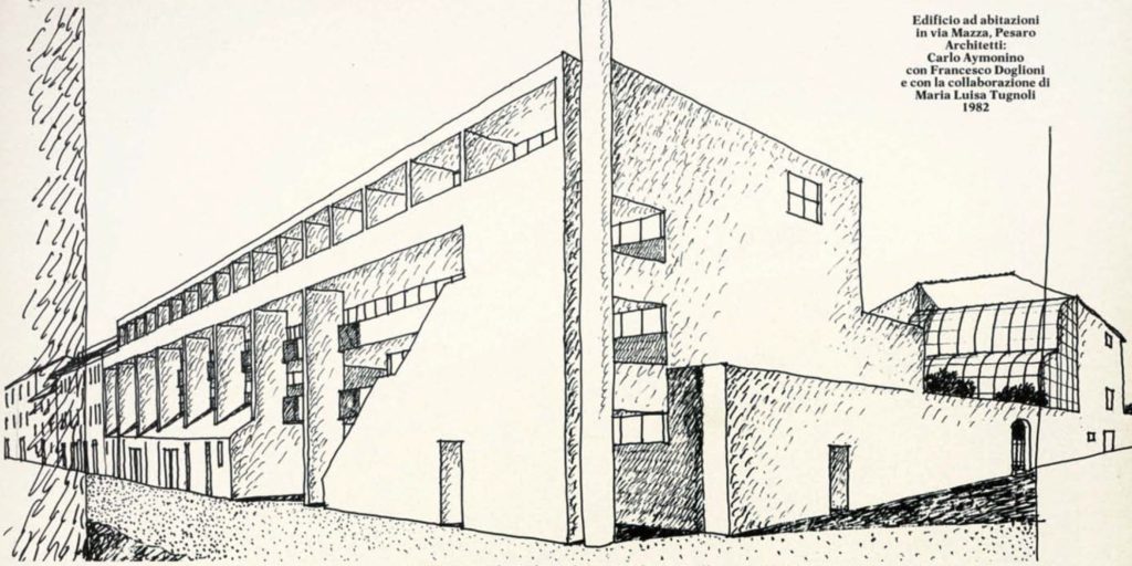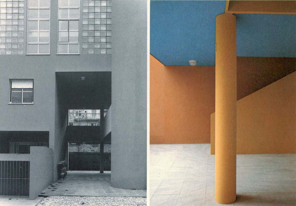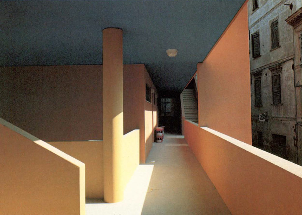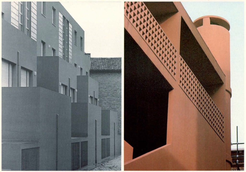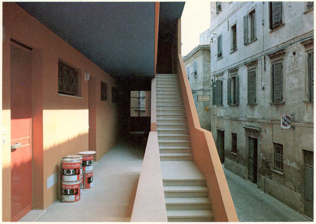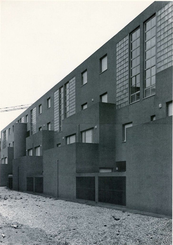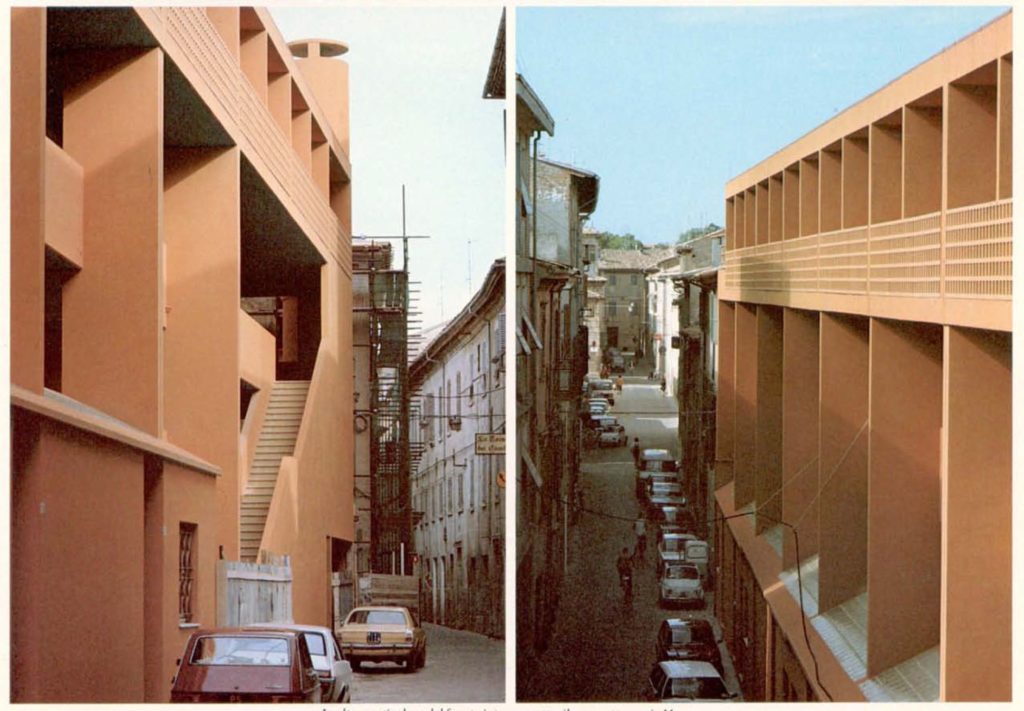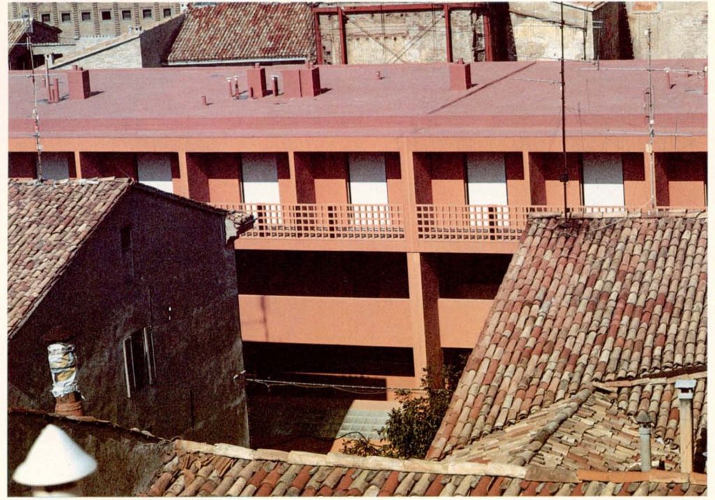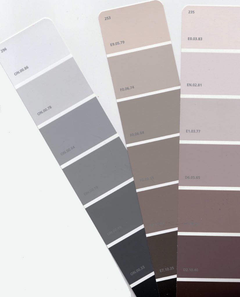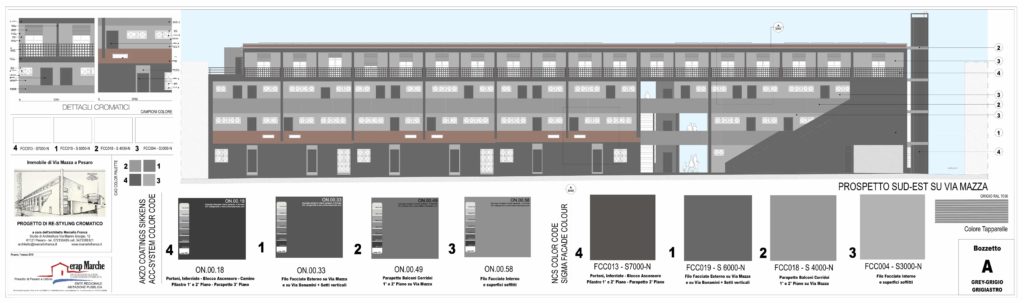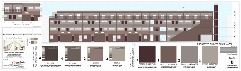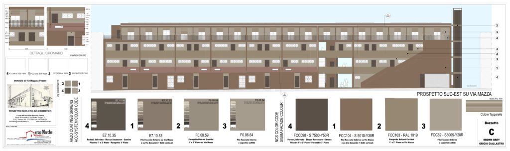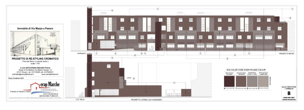
ENG_On behalf of ERAP Marche for the invitation of the Municipality of Pesaro I designed and followed the color restyling of Palazzo Ajmonino in Via Mazza in Pesaro under renovation. In a first contrary and sincerely fearful of putting hand, even if only on color, to a work by a great architect who in Pesaro, as in Italy, has certainly left an indelible mark, I then tried to follow a logical thread in full Respect for the architectural and volumetric morphology of the entire building. To succeed in this undertaking, I asked for help from the “gray family” and in particular to the “gray-gray” father and to two of his sons the “yellow-gray” and the ” reddish-gray “. I then proceeded to put all three of them side by side and let the managers of Erap and the Municipality make their free choice. The use of “neutral” shades chosen from the “gray” scale allowed me to reach a proper chromatic compromise and avoid, with other colors, to falsely imitate the Maestro or worse to ruin the Opera falsifying with colors the rhythm of the scans volumetric of which the entire architecture of this building is rich.
ITA_Su incarico di ERAP Marche per invito del Comune di Pesaro ho ideato e seguito il restyling cromatico di Palazzo Ajmonino in Via Mazza a Pesaro in corso di ristrutturazione. In un primo contrario e sinceramente timoroso di mettere mano, sia pure solo sul colore, ad un’opera di un grande architetto che a Pesaro, come in Italia, ha certamente lasciato un segno indelebile, ho cercato poi di seguire un filo logico nel pieno rispetto della morfologia architettonica e volumetrica dell’intero fabbricato, Per riuscire in questa impresa ho chiesto aiuto alla “famiglia dei grigi” ed in particolare al padre “grigio-grigiastro” ed a due dei suoi figli il “grigio-giallastro” ed il “grigio-rossastro”. Ho provveduto poi a metterli tutti e tre l’uno a fianco all’altro e lasciare i responsabili di Erap e del Comune facessero la loro libera scelta. L’utilizzo di tonalità “neutre” scelte dalla scala dei “grigi” mi ha permesso di raggiungere un doveroso compromesso cromatico ed evitare, con altri colori, di imitare falsamente il Maestro o peggio rovinare l’Opera falsando con i colori il ritmo delle scansioni volumetriche di cui è ricca l’intera architettura di questo fabbricato.